NI Package Manager
Role
Project Type
Introduction
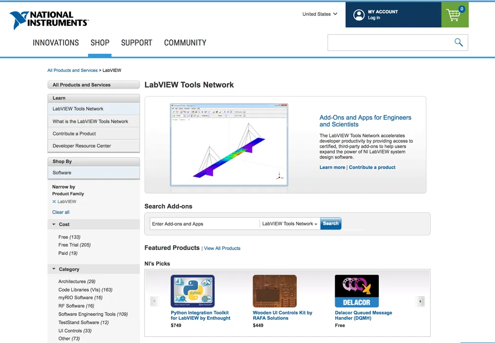
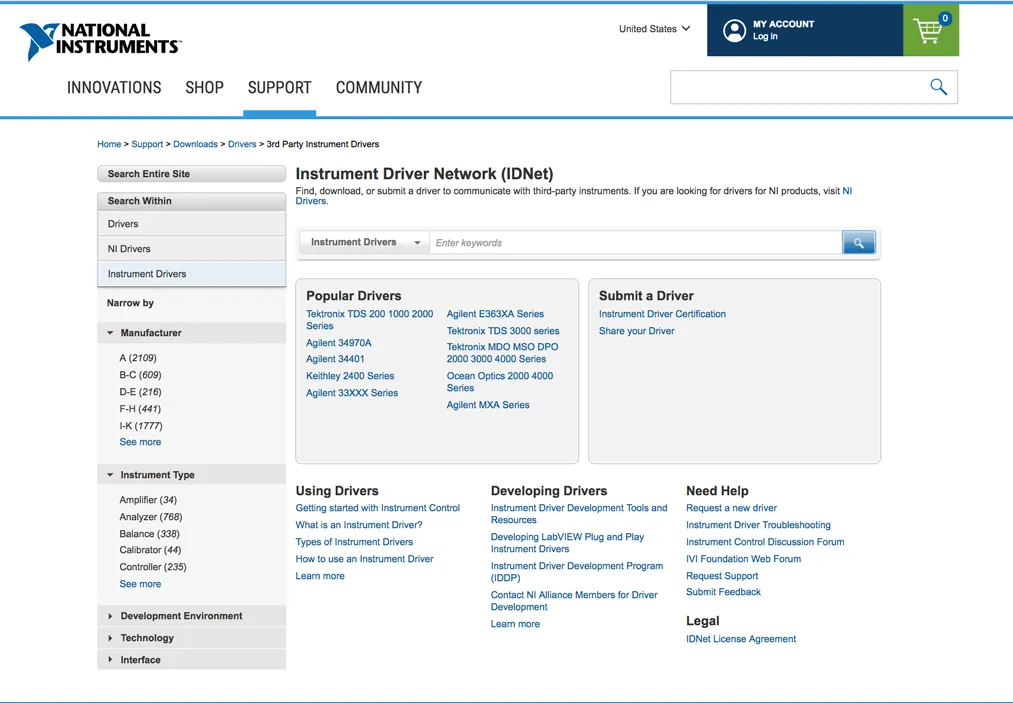
The goal of this project was to design the first release of the National Instruments Package Manager (NIPM). It is a product that allows users to extend LabVIEW, a graphical programming IDE. From NIPM, a user can easily download install new templates, controls, drivers and language libraries to help them create more robust applications. Prior to this application, acquiring packages was done via a browser through the LabVIEW Tools Network or the Instrument Driver Network (IDNet) and manually installed. NIPM’s core mission is to consolidate and simplify all of this into one application for finding and acquiring all of the items that were previously spread across the web.
I developed the overarching design strategy and produced the interaction design deliverables. I coordinated these designs with the primary visual designer on our team. This case study focuses on the work done to define the design direction for the application.
The Strategy for the Strategy
My initial goal was to ensure all of the project stakeholders were on the same page. This meant making sure that we all shared a common knowledge, vocabulary, and understanding of the desired design direction. From experience, I knew I needed to avoid a situation where one stakeholder believes we are building the iOS App Store and another believe we are building something closer to NuGet package Manager for Visual Studio. While similar applications, in a sense, they show different priorities and organization and have vastly different patterns to present their content.
Standing on the Shoulders of Giants
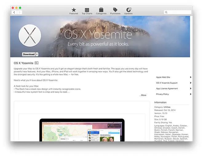
From the basic description of this product, you may see it as I did….basically an App Store. Actually, somewhere between an App Store, Extension Manager, Plug-in Manager, etc. Luckily, there is no shortage of others who have built something like this which means we can easily learn from others and avoid reinventing a wheel that doesn’t need reinventing. This allows us to move quickly through the basics and focus our efforts on the areas of the experience that are unique to our content and users.
The steps I took to get alignment from the stakeholders were the following:
- Perform an industry audit of applications.
- Establish a shared understanding of the design direction.
- Facilitate the definition of our desired design approaches from the stakeholders.
The Audit
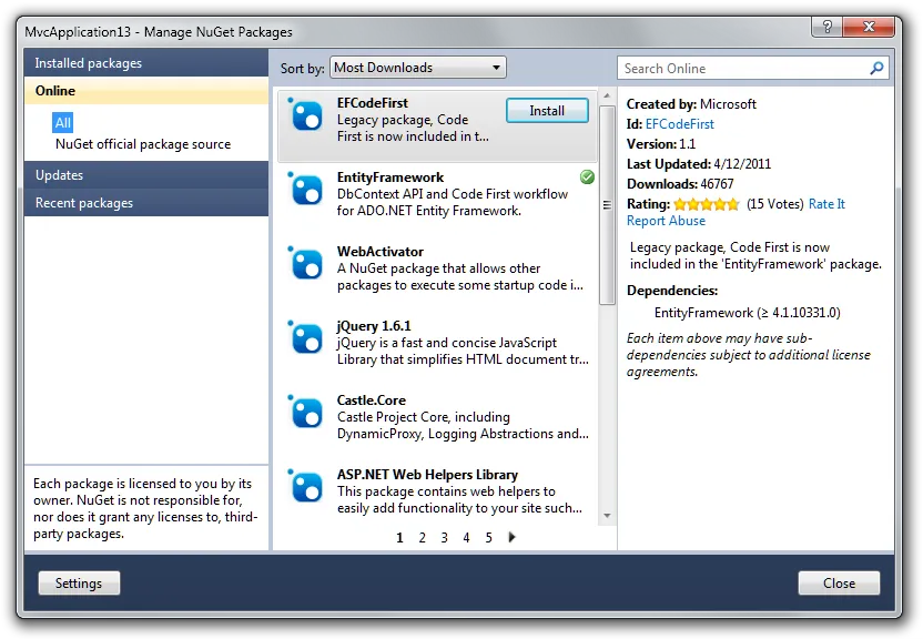
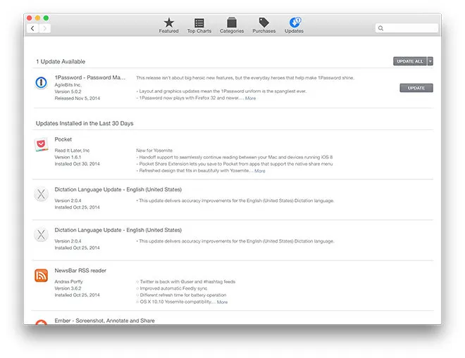
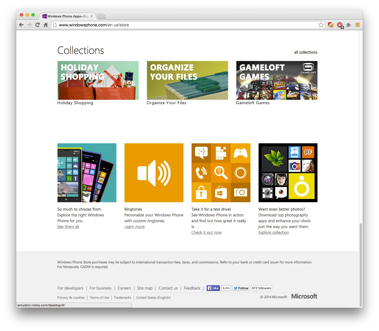
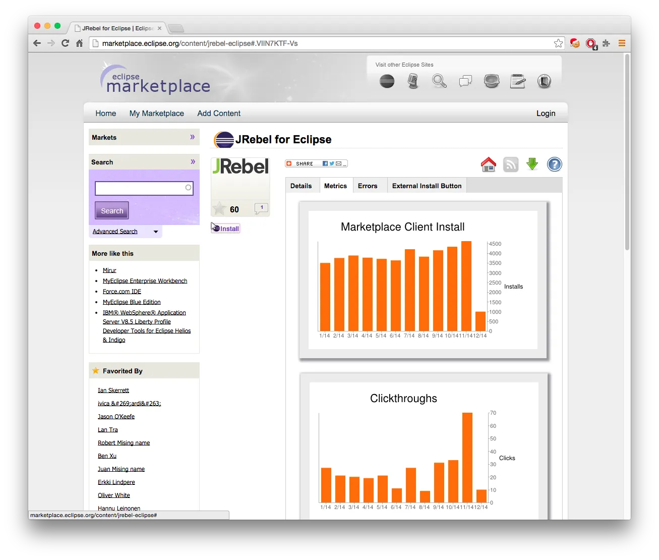
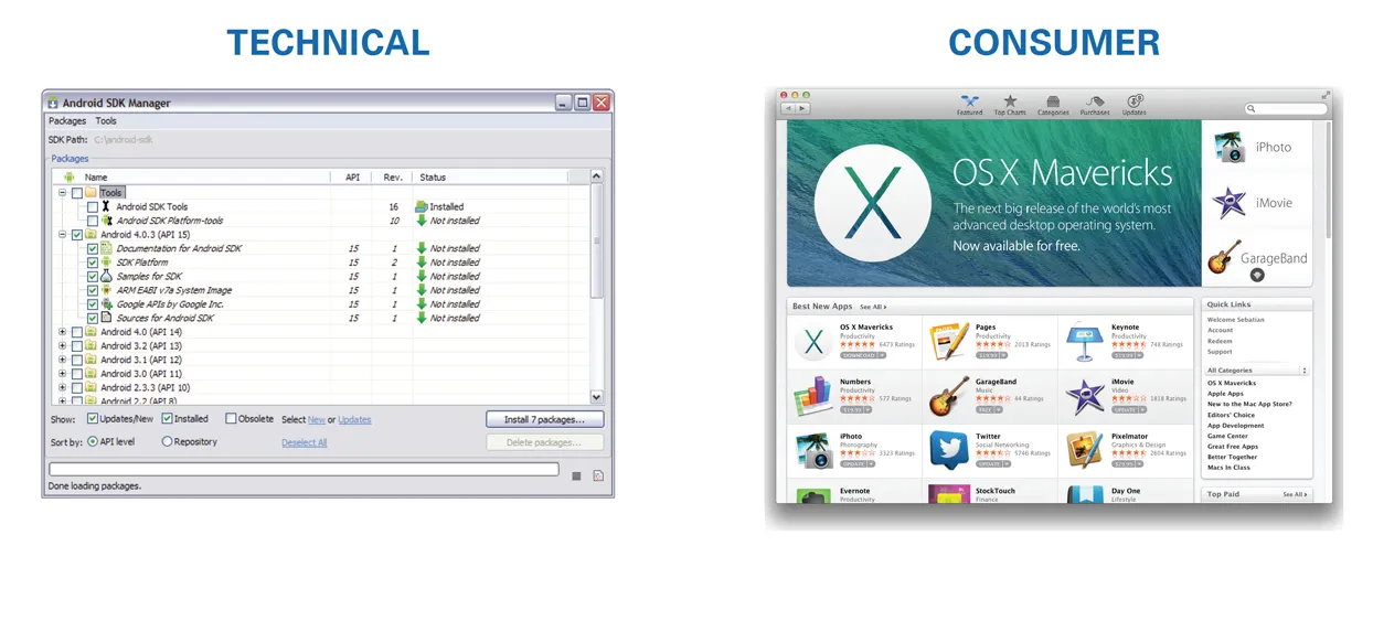
There was no shortage of places to look for Package Management/App Store-like software. The list contained very relevant examples like NuGet Package Manager, Android SDK Manager and the Ubuntu Tweak Application Center and also included products that were more well known but not necessarily the exact same content like the iOS App Store, Android Marketplace, and Evernote App Center. These, along with many others, allowed me to identify some common patterns as well as some notable features that may be valuable to our users. Some notable features that jumped out were things like providing the update history for items, organizing content into collections for highlighting related content and providing metrics for the activity around a package to help communicate its credibility and popularity. From this analysis, I was able to identify a set of design aspects to discuss and establish with the stakeholders.
Notable Features Example
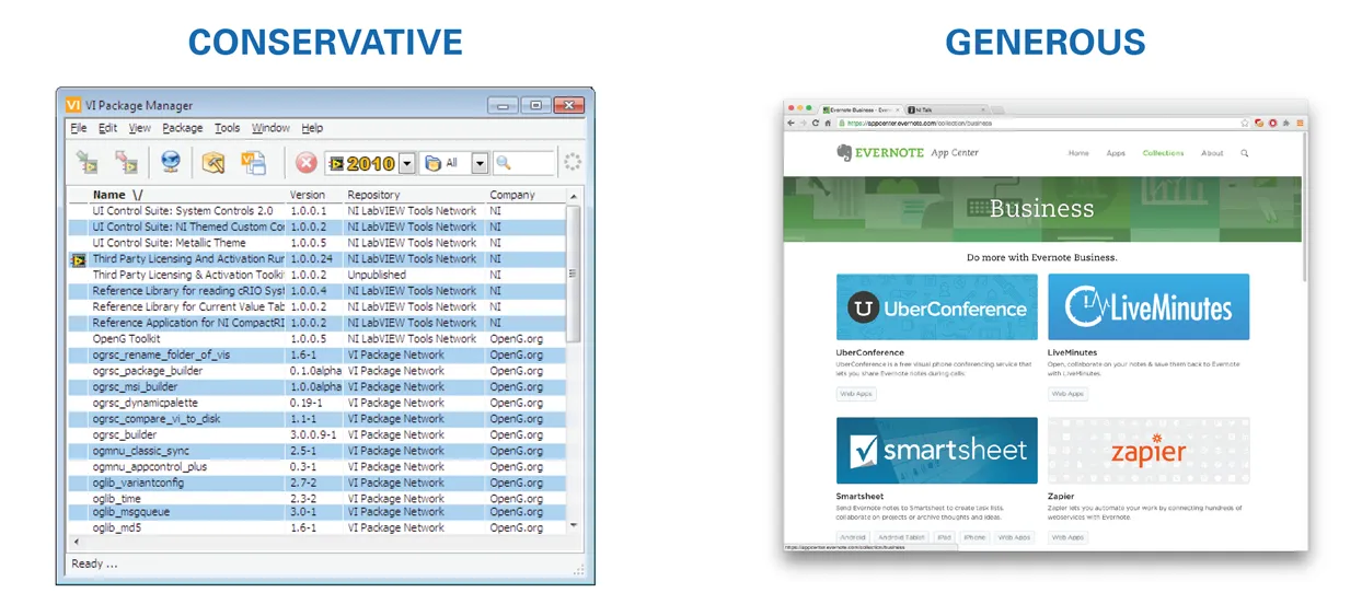
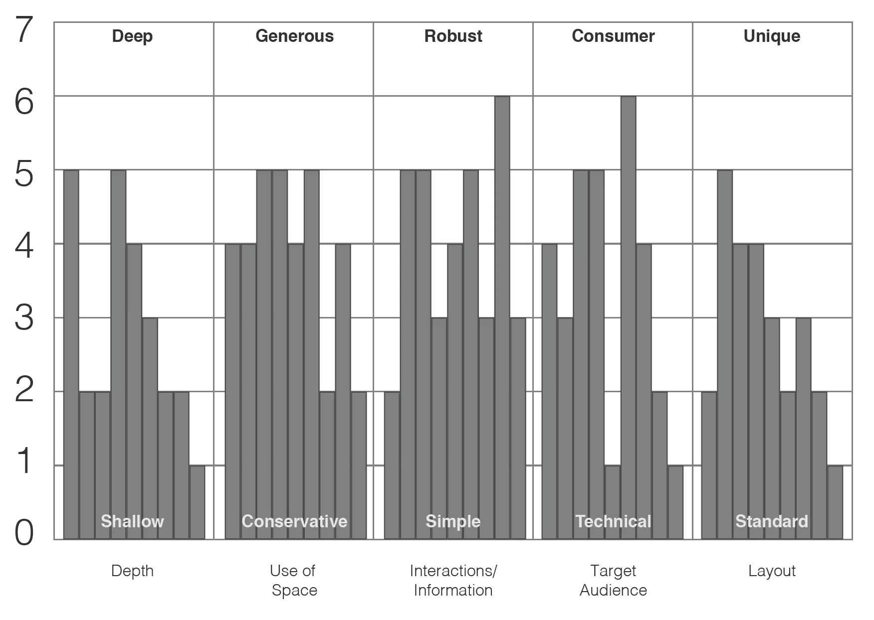
The next step involved summarizing the information I had gathered as it was going to set up the attributes we used to define and eventually measure any design created. I presented the information I had gathered and rolled it into explicit aspects of design in order to begin defining the vocabulary for a direction to be defined. Each design aspect contained a range. For example, an aspect called, “Use of space” had a range from “Conservative” to “Generous”. Depending on the example products I was showing, each one fell somewhere on that scale. Our product, as well, would fit somewhere on that scale. Other design aspects and their ranges were defined. Examples of each design aspect were given to provide a common understanding of how something like a generous use of space looked in an application. This was our framework for defining the design direction.
Design Aspects and Examples
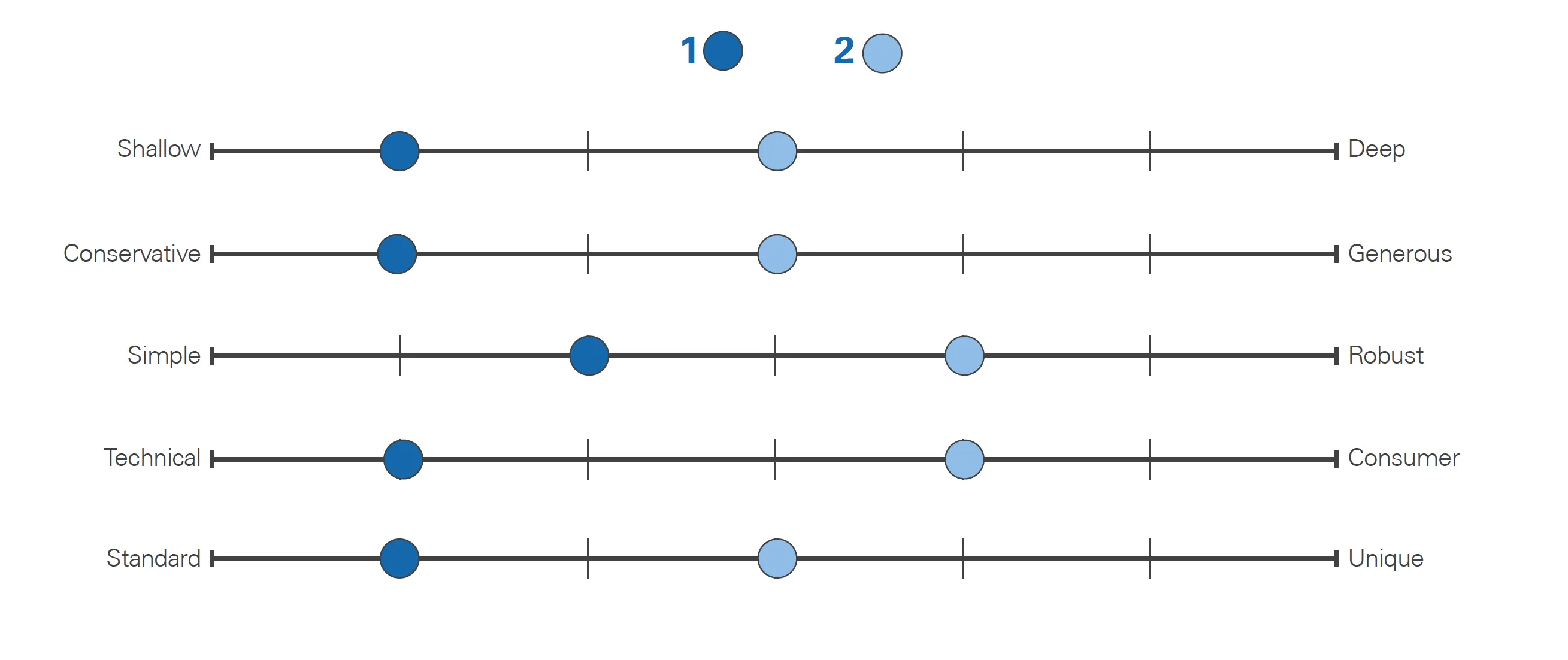
Pick a Direction…or Two As the last step towards defining a design direction (two actually), I used our shared knowledge of the framework to gather feedback from the stakeholders as to what they believed our product should be achieving along the design aspect ranges. This was done as a paper survey to each stakeholder which I then summarized into two directions to begin the design effort.
Ultimately, this series of steps accomplished a few things towards the successful design of the product. Firstly, this particular set of stakeholders had never worked with a User Experience Designer before and it showed them that, while a very creative field, designers do have a systematic approach to defining and solving problems. Secondly, it provided a ubiquitous language and direction that fueled every subsequent review. We were all using the same words to mean the same things. Moreover, I was able to avoid a situation where one stakeholder believed we were making something like Apple and another believed we were creating something like Android SDK Manager. We had a shared understanding of the direction we were taking. A small, but crucial victory. Lastly, and perhaps most important for this project, it removed subjectivity and personal bias from design review and evaluation. Designs were measured based on how they stacked up against the design aspects, not how one individual thought something was good or bad. The conversations were phrased as “Does this design appear targeted at a more technical audience or a more consumer audience?” and “Is the layout of information too conservative or too generous?” We had all those ranges defined and we knew where we were trying to hit. It made the refinements of the design a series of simple tweaks and finalizing the design a straightforward process. It also made the stakeholders an integral part of defining the direction and seeing their input realized in the design.