LabVIEW Palette
Role
Project Type
Introduction
The story of the Palette is filled with discovery, collaboration, and continual evolution. For the primary software provided by National Instruments (NI), LabVIEW, the Palette is the most frequently used and essential feature of the product. When I began at National Instruments, LabVIEW was being redesigned from the ground up and this included a complete overhaul of the Palette.
Over the past 6 years, I have taken the lead in the re-design of the Palette for LabVIEW and continue to be the shepherd that evaluates the current implementation and drives new features and functionality to this fundamental aspect of the LabVIEW experience.
A Little Background
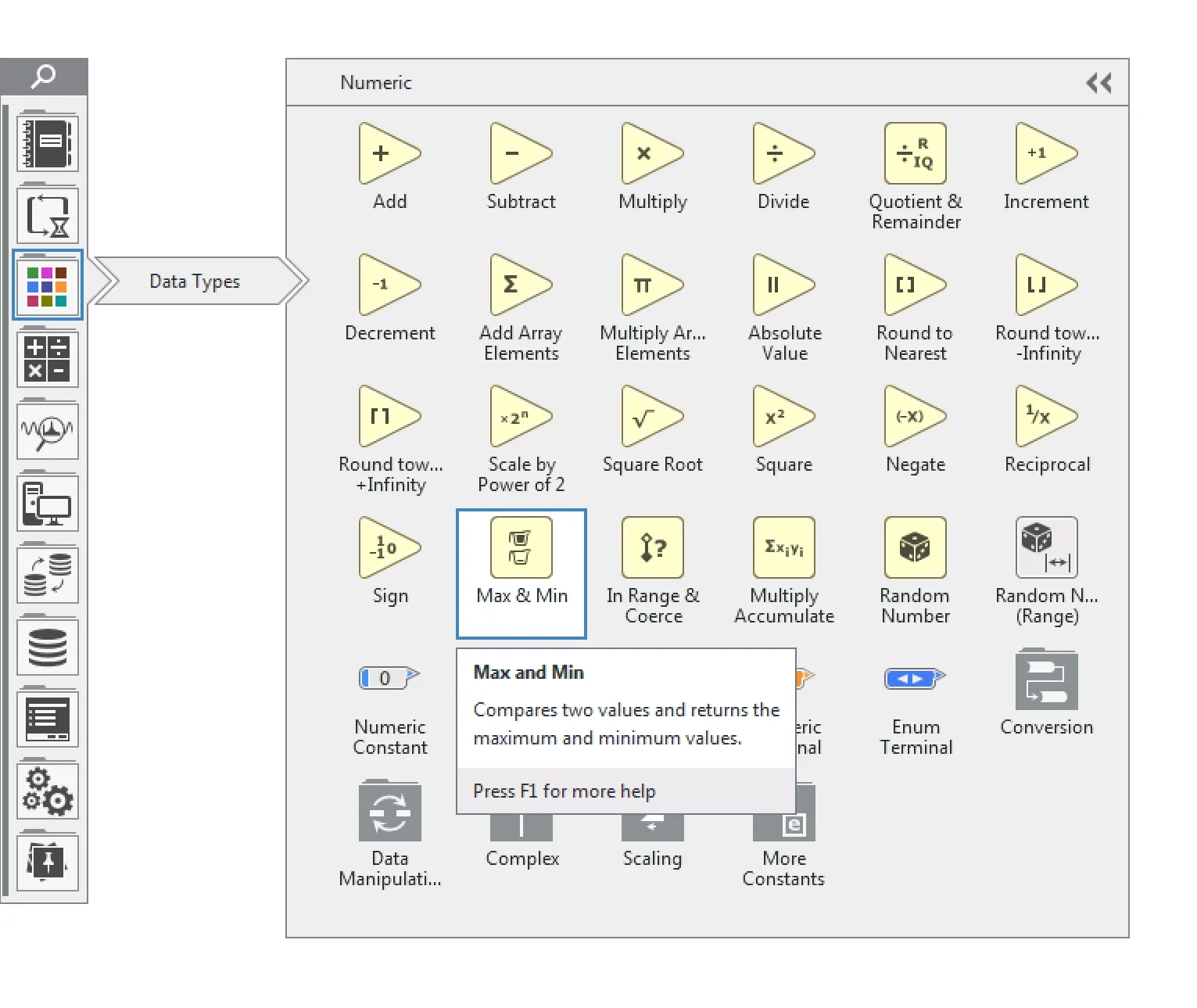
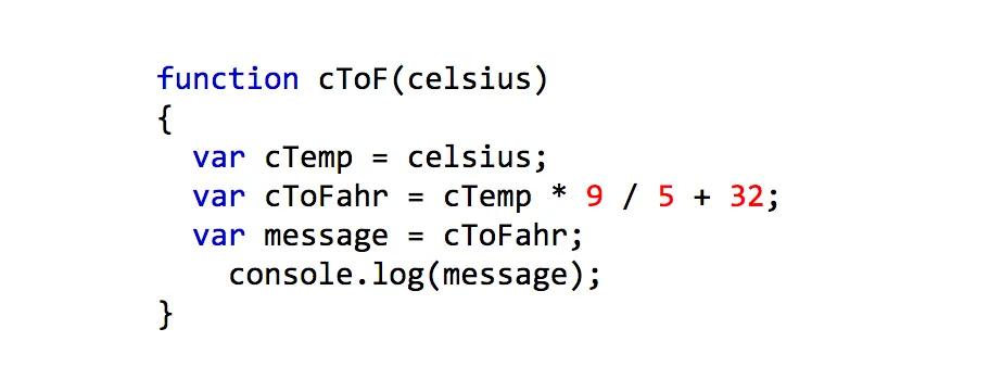
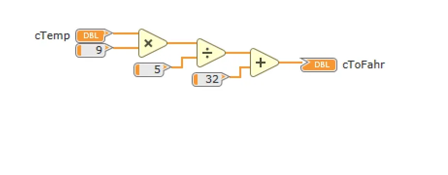
LabVIEW is an integrated development environment (IDE) focused on the creation of graphical code. In contrast to textual code that uses typed words to form logical sentences, LabVIEW uses a series of graphical nodes that are wired together into “sentences”.
Example code for converting Celsius to Fahrenheit
Javascript code example
LabVIEW code example
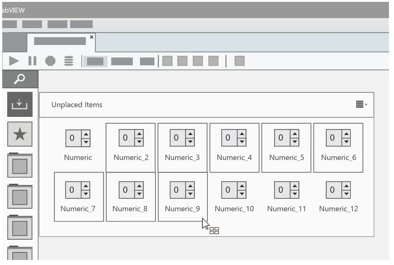
This means the language that LabVIEW (G language) is comprised of a large number of symbols as opposed to letters. In fact, at the time of this writing, the G language contains over 4000 symbols and continues to grow everyday. Those symbols need a home in the UI of the product. At its simplest, there must be a place where the user can access, browse and find the particular symbol they need to create the logic for their application. This is the fundamental functionality provided by the palette…access to the G language. The Palette needs robust navigation and a very understandable sense of order and organization to be successful for our users.
Not the First to Try This
I took on the redesign of the palette very soon after joining NI. It wasn’t my first project but it was one of my first. At the time, the design team at NI was still forming. Even as one of the initial members of this team (of 4 designers), I was not the first to attempt a redesign of the palette. Any prior attempts had encountered formidable internal roadblocks. Other designers had made attempts and there were also some engineers that took a crack at the design prior to the existence of a design team. Unfortunately, those attempts just never got any traction.
As the entire product was being re-written from the ground up, it gives designers an often coveted, but dangerous, opportunity…a blank canvas. However, the previous design of the palette had seen over 25 years of runtime and feature evolution and some people don’t appreciate change as much as a designer may wish. And while some legacy users had become quite efficient at using the current palette, new users always struggled with it. It didn’t use modern interaction conventions mostly because 25 years ago, when LabVIEW was introduced, those conventions didn’t exist. It also wasn’t discoverable. The only way to make it appear was to right-click with your mouse. And while internal people and legacy users had this ingrained in them, it was the least discoverable way to show it to new users. Because of all that muscle memory and legacy knowledge, any design that ventured away from it didn’t go over so well with internal colleagues which meant the design didn’t move forward. The individual working on the design would tend to get deflated and the design effort would slowly fade as other projects became a higher priority.
That is when I entered the picture. Learning from the challenges others faced, and a few lessons from experience, there were a few things I introduced to help the project move along:
-
Don’t try to do this by yourself
-
Design it for the user
-
Communicate early and often
Don’t Try to Do This by Yourself
This was the first thing I saw. One designer, taking on the world of this highly visible feature. I was still learning where the bathrooms were, so to speak, and was not in a position to push a new design like this through with brute force. I knew I needed more folks than myself invested in any new design. In order to do that, I made sure many people were a part of the design. This manifested as a short but intense brainstorming session that included the entirety of the design team, at that time, and a few passionate folks that were not necessarily designers but could add a great deal of knowledge, history and subject matter expertise to the effort.
As the design team was new at NI, some of the abstract, conceptual exercises we do were not familiar territory for many of the people in that room. Our passion for whiteboard sketching and post-it note grouping (a.k.a affinity mapping) had not yet to become a part of the culture, so I had to try to make it fun…and productive. To the right, you can see the agenda of this working session.
Working session agenda
2:05 PM - Introduction
2:15 PM - Anti-Problem
- An exercise to design the worst version of solution
- Split people into two groups
- Goal - “How do we make users hate the Palette?”
2:30 PM - Brainstorm natural stuff
- Since organization played such a large role in the palette, I asked the room to identify items in the world around us that provided organization.
- Goal - Each person come up with 5 items from the world that have some level of organization, structure, patterns, etc.
2:40 PM Group Design I
- Using a subset of the items created from the brainstorming, the group was split into 3 teams to take a few of the items and design a palette around that item.
3:05 PM - Break (10mins)
3:15 PM - Presentation I
- 3 minutes per team to explain their design
3:25 PM - Group Design II
- Mix up the teams
- Assign a new item from the previous brainstorming
- Repeat design task
3:50 PM- Presentation II
- 3 minutes per team to explain their design
-Done by 4PM with a large set of new ideas on how to present a palette of object to the user. Were they refined, polished ready to build ideas?…nope but they were a great start. I was able to take the abstract, conceptual sketches and transform them into more structured UI’s for review, discussion, and refinement.
-Most importantly, everyone had a voice and something valuable to contribute. This was already helping with internal momentum for the project.
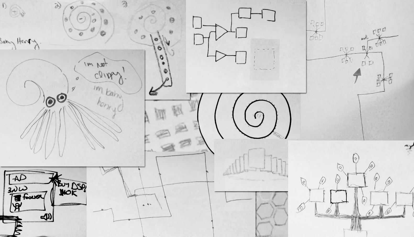
Some of the glorious artwork we created in that small amount of time. We had palettes inspired by nautilus shells, trees, subway maps, honeycombs and everything in between.
 From those initial drawings, I refined the ideas into tangible UI concepts for organizing, way-finding and navigating a larger set of content in context.
Communicate Early and Often
Given the highly visible nature of the Palette and its history in the product and the company; I was not going to be able to refine and finalize the design in a vacuum then come down from the mountaintop with the glorious solution all dialed into perfection. For this feature, in this environment, that was not going to be successful. I needed to share every step of the way and be open to input and feedback every step of the way….from anyone in the company. This led me to an extremely transparent design process. Historically, I had protected my work until it was at a point where it could be reviewed and communicated the precise story I was trying to tell. In this case, any deliverable I was creating was shared as soon as it was in a form that was able to be shared. Drafts of documents were posted before they were polished, sketches and drawings were stuck all around my work area where anyone walking by could take a look and provide their input. Nothing was sacred and nothing was private.
As the design began to take form and people had begun to see small portions of the design get implemented as part of an iterative development process, it seemed appropriate to provide an opportunity for anyone in the company to provide input, praise or harsh criticism to the solution we were going forward with. To achieve that, I organized a town hall environment and invited the entirety of the Austin R&D staff (a couple hundred folks) to attend. Around 40 attendees appeared to provide their thoughts and input on the design. During this town hall, attendees were able to share their own passion for the palette and we were able to do the same. Through that conversation, I was able to easily communicate the short and long term strategy for particular features, get some new ideas on how to improve the design and, ultimately, provide an all-inclusive venue for people to have their thoughts and feedback heard.
As a third, and continued, part of the design process, I conduct an annual survey for the current state of the palette. This is done in addition to testing for particular features. This survey is distributed internally and externally to help us benchmark and measure our progress towards success and provide a frequent channel for input and ideas. Through this effort, I have continued to evolve this feature over the past few years to get it to a state that makes our legacy user base successful, is learnable by new users and provides substantial enhancements over the previous implementation.
Design It for Our Users
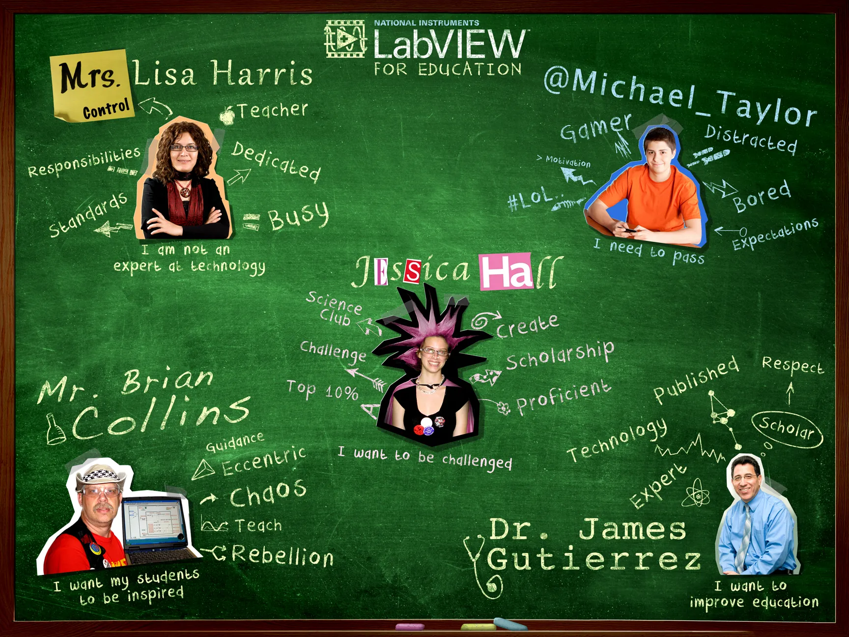
Having only been around for a few months, I had already noticed a practice that I have worked diligently to remove from my practice…..designing for myself. Admittedly, the occasions where I saw this were not from other designers, but the design team was new and stuff still got designed before we existed. I heard it in meetings and in other conversations. Things like, “That’s not how I would use it’” or “I would expect to see something here”. This struck a chord with me as part of my own design philosophy is, “You are not the user…..and neither am I.” For the product we built, a graphical programming environment, removing my own, subjective, expectations was pretty simple since I wasn’t remotely similar to our target user(s). For the rest of the audience, I needed to point their attention to the actual users so that we could address their needs and expectations, not our own. This is when I began a persona development process for the product that the palette would be introduced in.
Luckily, this product was targeted at the secondary education market and the key users were a science teacher who never had any experience with our products and a teenage student who just needs to pass class so he can play his XBOX or SnapChat his YouTubes or whatever kids are doing these days. Having these core personas in place (along with a few secondary personas) immediately changed the conversation from, “What would I expect?” to “What would Mrs. Harris expect?” Again, I did not conjure these personas on my own. While I provided a considerable amount of research on potential users, it was the product and marketing teams that helped refine and prioritize the users for the first release of this product.
The Story Continues
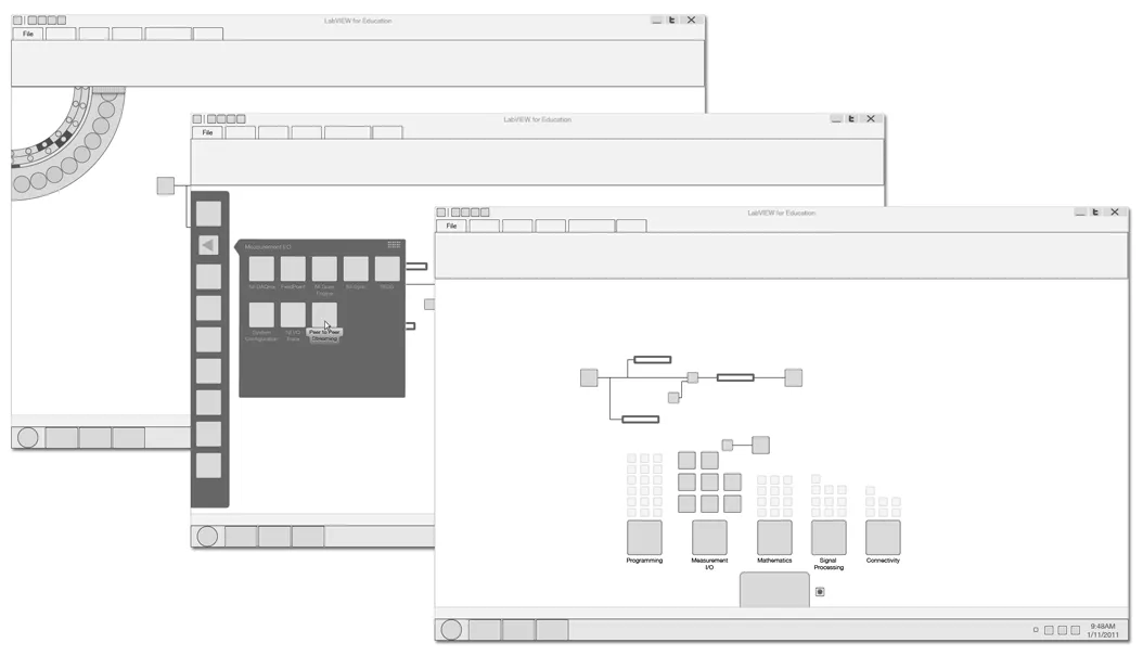
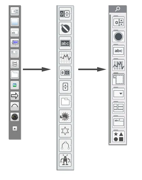
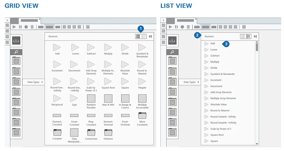
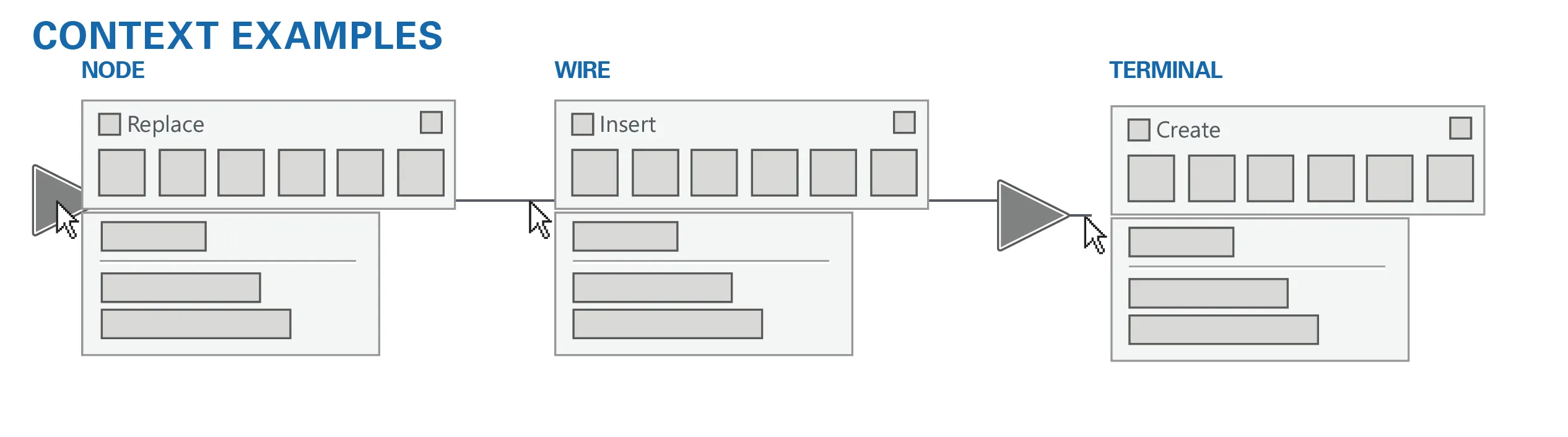
This particular feature is one that is never truly, “Done.” It is a cornerstone of the product and sees evolution in each release of the product, some stages more substantial than others. For smaller features, such as providing a List view and a Grid view, I produce the designs and work within a small circle of stakeholders. For larger efforts (most recently called, Palette 2.0), I use the same strategy of grabbing a bunch of people to help in the generation of ideas, ensure we are designing for our users and using a completely transparent design process. From this, the Palette has been one of the most successful and stable parts of the product to date. For a product that is being rebuilt from the ground up, many aspects fundamentally change as we try new ideas and test them. The Palette has provided a stable foundation to build around and the process of its design is continually looked at as a template by which other large features should be approached.
Feature Evolution Examples
List view
Contextual palettes
Multi-select