Building the Case for a Design System
Role
Project Type
The Project
In 2020, following a significant company rebrand, we needed to update our entire software portfolio across multiple platforms and codebases, from modern Angular and C# products to decades-old C++ applications, while also planning for future brand changes. The goal was a proof of concept to determine the feasibility, priorities, and cost of implementing a consistent, maintainable design system across that diverse landscape of products.

Responsibilities and Contributions
Working with a team of 10 over one week, my contributions fell into three areas:
- Driving decisions alongside our Chief Software Architect
- Defining the architecture for our design token system
- Developing an Adobe XD plugin to translate token output into design assets for our team.
A Look Outside
Before building anything, we researched existing solutions. We adopted Amazon’s StyleDictionary as our core translation tool and studied large-scale design systems like Adobe Spectrum, IBM Carbon, and Salesforce Lightning for architectural guidance. Adobe also provided direct input on their rollout strategy, which saved significant time.
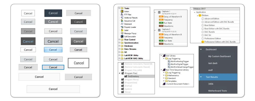
A Look Inside (a.k.a. The Audit)
I audited our full product catalog to understand the scale of inconsistency, prioritize platforms, and scope the eventual design system effort. The audit produced a clear picture of the problem across the entire portfolio.
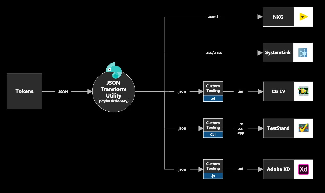
The Tooling
The tooling concept was straightforward: take design tokens defined in JSON and transform them into formats each platform could consume, such as CSS for web products. StyleDictionary handled most of this, with custom middleware built for older platforms that needed additional integration work.
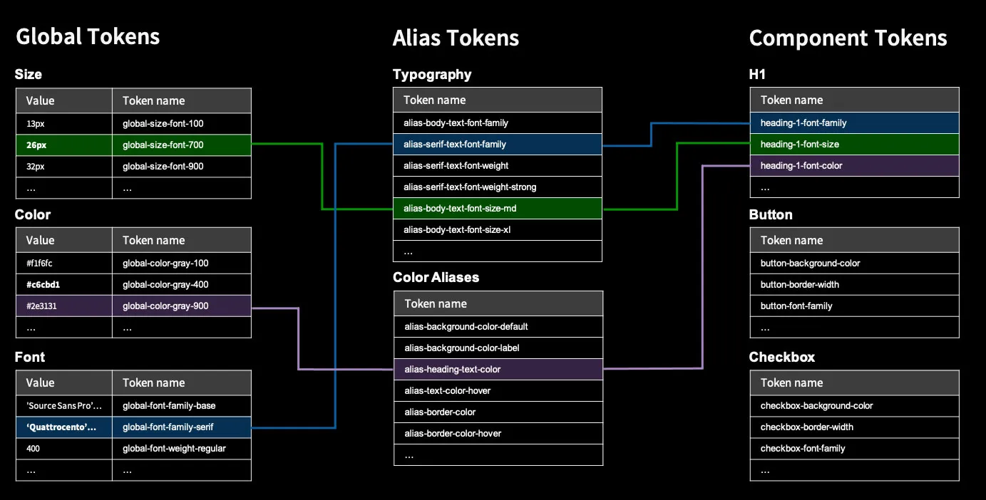
The Architecture
I defined a three-layer token architecture, heavily influenced by Adobe Spectrum, to balance reducing redundancy with allowing specificity:
- Global Tokens are the core values of the system, such as typeface or base colors, rarely referenced directly by components.
- Alias Tokens add context and provide grouping so visual properties can be changed across a set of related components.
- Component Tokens are the most granular layer, representing every visual property of a specific component.
The Outcome
With tooling and architecture in place, we successfully applied a new color palette and typeface across a representative set of products. Key learnings included:
- Modern technologies are easier to update
- Older ones are feasible but complex
- Color and typography have the highest impact on consistency
- New features are the best entry point for existing products.
Ultimately, the proof of concept was a success. We proved feasibility, established priorities, and convinced leadership to make an investment in creating this system.