Process Evolution
Role
Project Type
Introduction
The design process at NI was deliberately built and refined over time. Rather than rigid instructions, it’s a consistent framework for solving problems. Because NI is engineering-focused, design was unfamiliar territory, so having a defined process helped us communicate our approach, set expectations, and build credibility.
2011 - Early Challenges
When I joined NI, I was one of four founding designers in a newly formed UX team for R&D. There was no legacy process or team to build from. My first goal was to understand how designs were being produced and address the most obvious issues. After a few projects, a clear picture emerged:
-
No process. Design had previously been handled by the developers building each feature.
-
Design by committee. There was no clear ownership, and decisions went to whoever spoke loudest.
-
A shift to iterative development. Engineering teams were transitioning to agile workflows, as most of the industry was in 2011.
-
4 designers supporting 400-500 developers. A 1:100 ratio meant we would become a bottleneck fast.
Not all of these problems were immediately solvable, but a clear first step was setting expectations, both within our design team and with our engineering and product partners. Drawing on my prior experience starting an internal design practice, I knew we needed to establish how we worked. This led to the first definition of our design process, titled simply “UX Process: How We Solve Problems,” built around two core messages:
1. 101-level overview of the design process
This section introduced exercises like stakeholder interviews, use case development, and prototyping, and how design and iterative development work together.
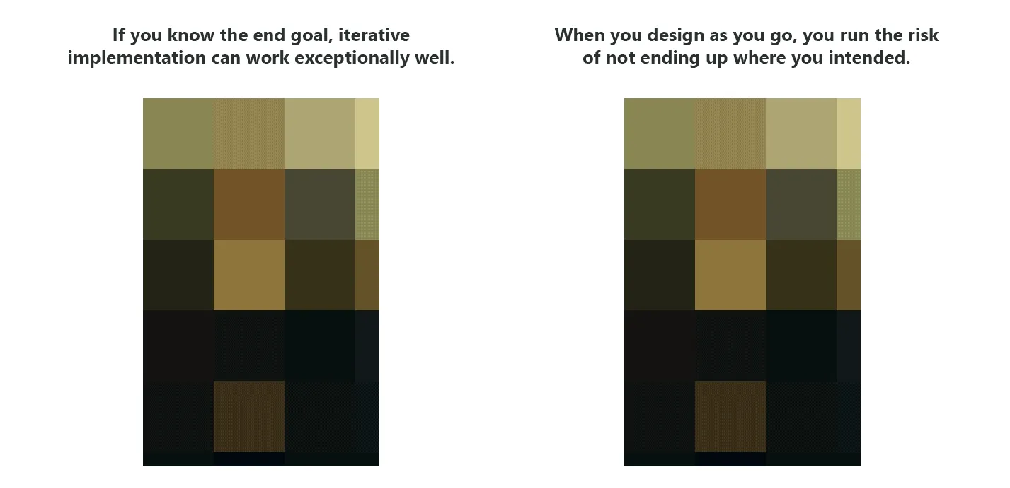
2. Understanding the risk of moving fast without clear problem definition.
To make the point, I used a series of progressively loaded Mona Lisa images to show how skipping planning can lead you somewhere you never intended.
For the first year, this approach worked well. Whenever we kicked off a new project, I walked the team through the presentation to set expectations around what a designer does and what they bring to the table. We also introduced a Discovery phase to ensure every project started with a clear direction and shared understanding of goals.
2012 - A little more formality
After year one, our team had doubled in size. We were taking on more projects, working with more engineers, and had a clearer sense of which exercises delivered value in our environment. Stakeholder interviews, for example, remained one of the most valuable starting points. They introduced the designer to the team, surfaced alignment gaps, and established how success would be measured.
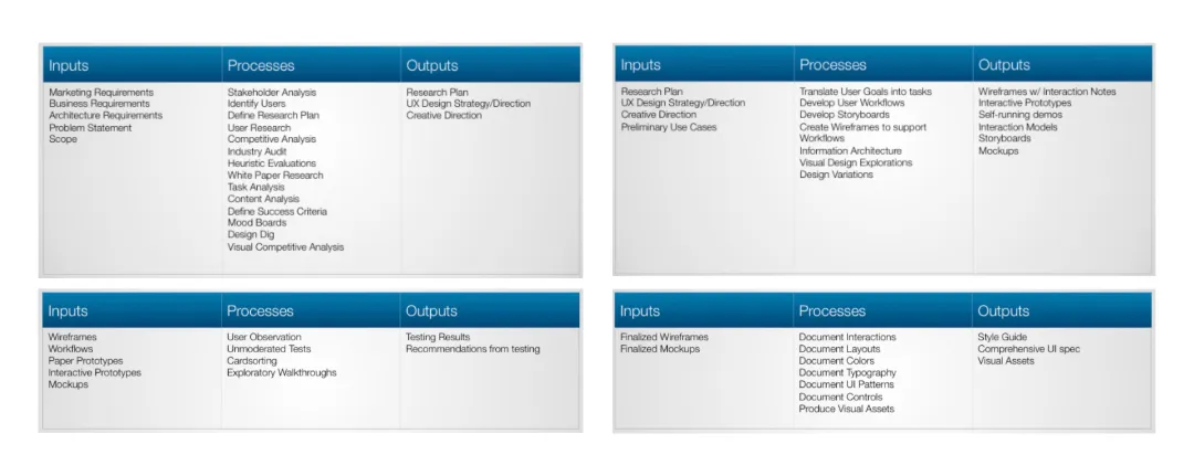
With that knowledge, we shifted from a broad list of design activities to a focused set of what designers at NI actually do on most projects. We also needed a common vocabulary across the team, since some engineers were now working with multiple designers. The goal for the year was to add structure to our process and create a simple infographic to communicate how we worked.
 Starting with existing artifacts, the team explored ways to consolidate everything into one visual.
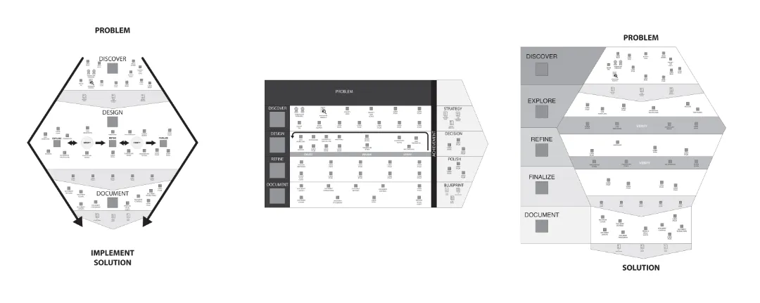 We began with wireframes to quickly generate concepts.
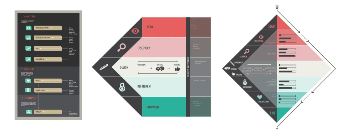 Members of the visual design team began generating higher fidelity mock ups.
2013 - Getting technical, consistent and unified
Our team continued to grow, and some engineering teams even redirected hiring budget to help build the design practice. But with that growth came new challenges. Our interaction and visual design teams worked together but delivered separately, and final assets were scattered wherever each designer chose to put them. Since designs could be finalized months before implementation, tracking down the latest files was causing frustration on both sides. We focused on three improvements:
Unifying our deliverables
Use the same toolchain. We had nearly as many design tools as designers, making it impossible to share assets easily. We standardized on Illustrator for design and InDesign for documentation. Adobe’s Creative Cloud launch made license management simple, and I provided templates, symbol libraries, and training to ease the transition.
Merge deliverables. Interaction and visual design had previously lived in separate documents, often in different locations. With a shared toolchain, both designers could contribute to a single deliverable. Source files were accessible to everyone, making updates and handoffs straightforward.
One place for everything. Files were scattered across network servers, SharePoint, email, and internal wikis. We consolidated everything into our collaboration intranet, making any deliverable searchable and findable by anyone, not just the designer who made it.

2014 - The Big Push for Integration
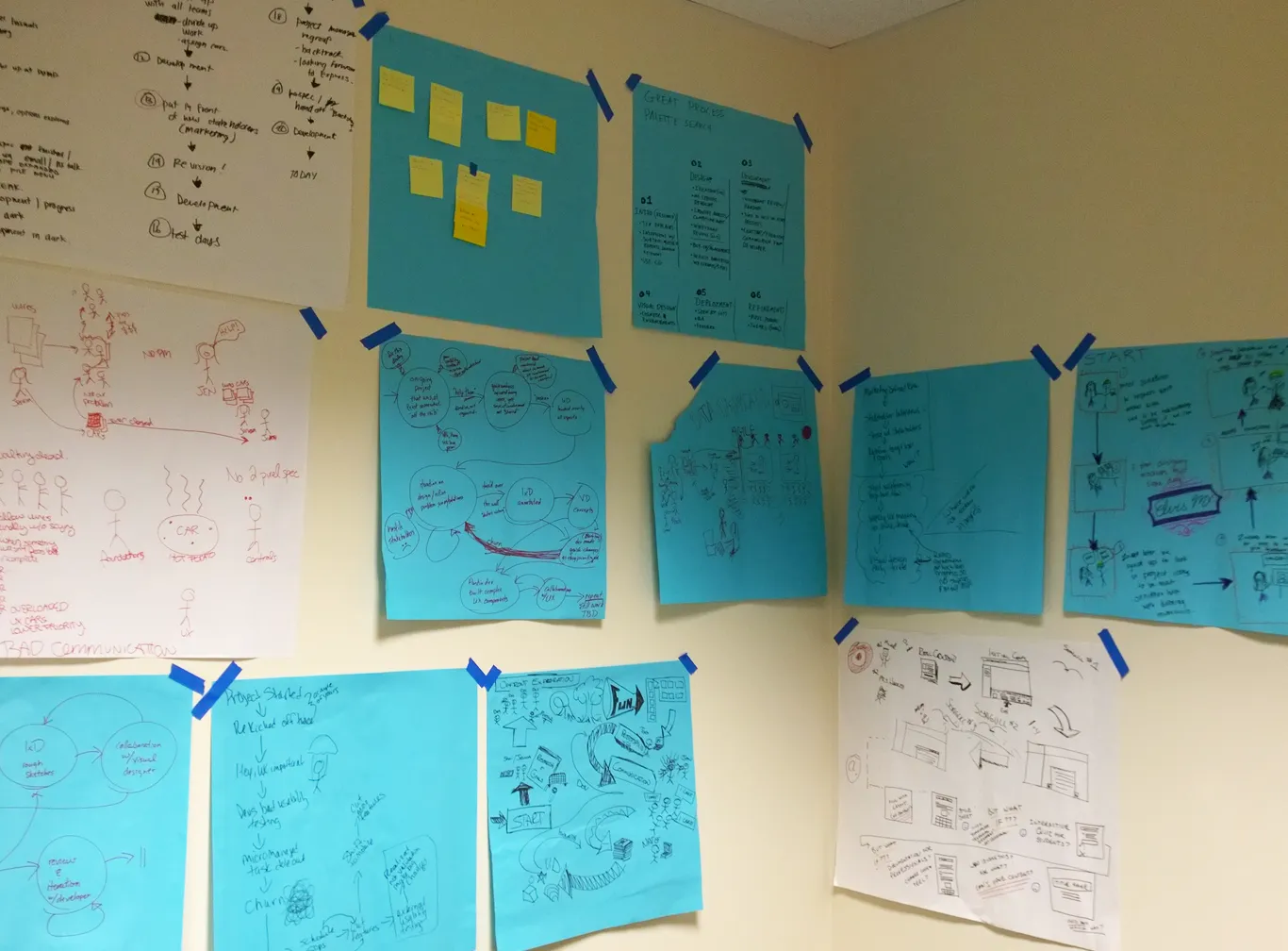
With the design process running smoothly, the next step was formally integrating it into the larger product development process. All teams (design, marketing, engineering) were asked to draft their ideal version of a unified process and present at a company summit. I led a series of workshops with the design team to inform our submission, working through three questions: What projects went well? What made them successful? What would an ideal process look like?
The team sketched out past projects, identified attributes that contributed to success or failure, and we used affinity mapping to surface common themes.
 Examples of very quickly created infographics of projects. Some good projects, some bad.
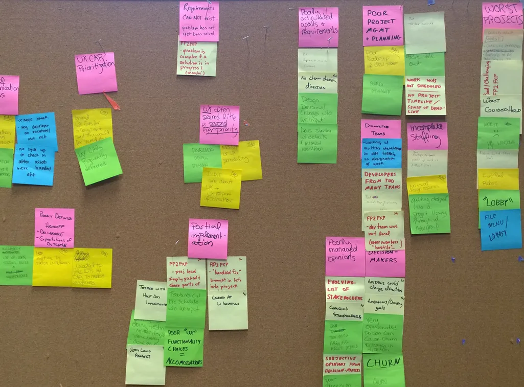 From the infographics, we identified attributes in the projects that contributed to their quality.
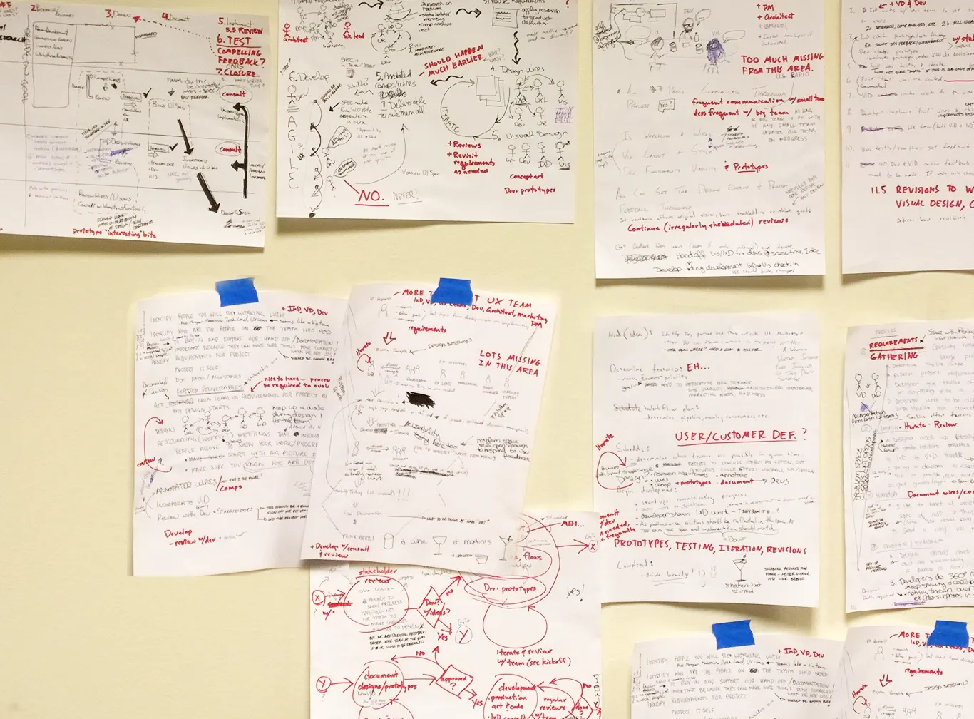 Example of a brainwriting exercise where each team member drew their version of an ideal process.
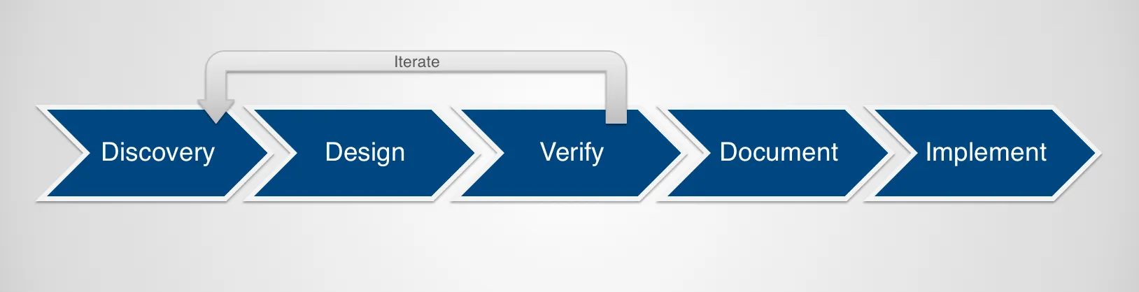
From there, a brainwriting exercise let everyone generate their own vision of an ideal process. After several rounds of review and refinement, we landed on the iterative process shown below.
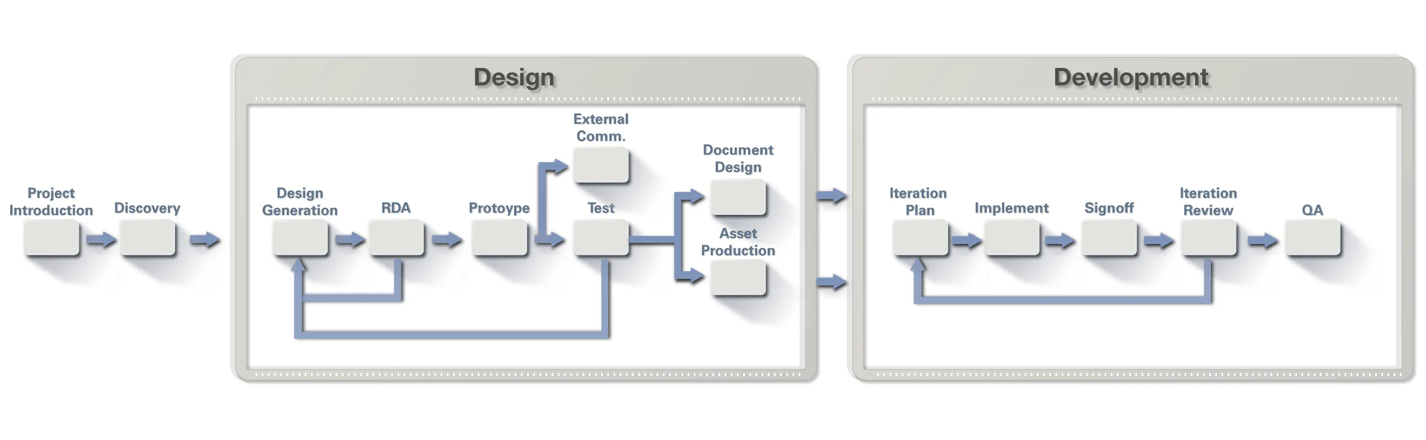
At the summit, design ended up as the foundation everyone else built on top of. It was an unprecedented shift, with design becoming a common thread through every stage of product definition, prioritization, and development.
Looking back over three years, we had gone from a small, scrambling team trying to keep pace with engineering to an established practice with a consistent process, real credibility, and a seat at the center of how products were built.